Concept case study · Unofficial growth concept for a Sri Lankan ride-hailing app
From install to a first ride you can trust
An unofficial concept for a new rider’s first session on a Sri Lankan ride-hailing app, from install to a first ride and its receipt. I did the desk research on public reviews and six competing apps, mapped the funnel, wrote the hypotheses and built a deployed, accessible prototype in English, Sinhala and Tamil with a control and a treatment, plus a plan for how I would test it. I am not affiliated with PickMe.
- Company
- Self-initiated concept
- Role
- Growth product designer · frontend engineer
- Year
- 2026
- Disciplines
- Design · Frontend
01 The brief
Public reviews of PickMe say the fare charged is higher than the estimate, that only the driver can end a trip, that drivers ask for cash on card trips, and that support tickets close without an answer. These are reviewers’ reports; I have not checked them in the app.
- ~30public reviews and posts reviewed, several only as snippets
- 13 screenswith Sinhala and Tamil on all 11 rider screens
- 0 axe violationsacross 78 route, variant and language checks
Before and after
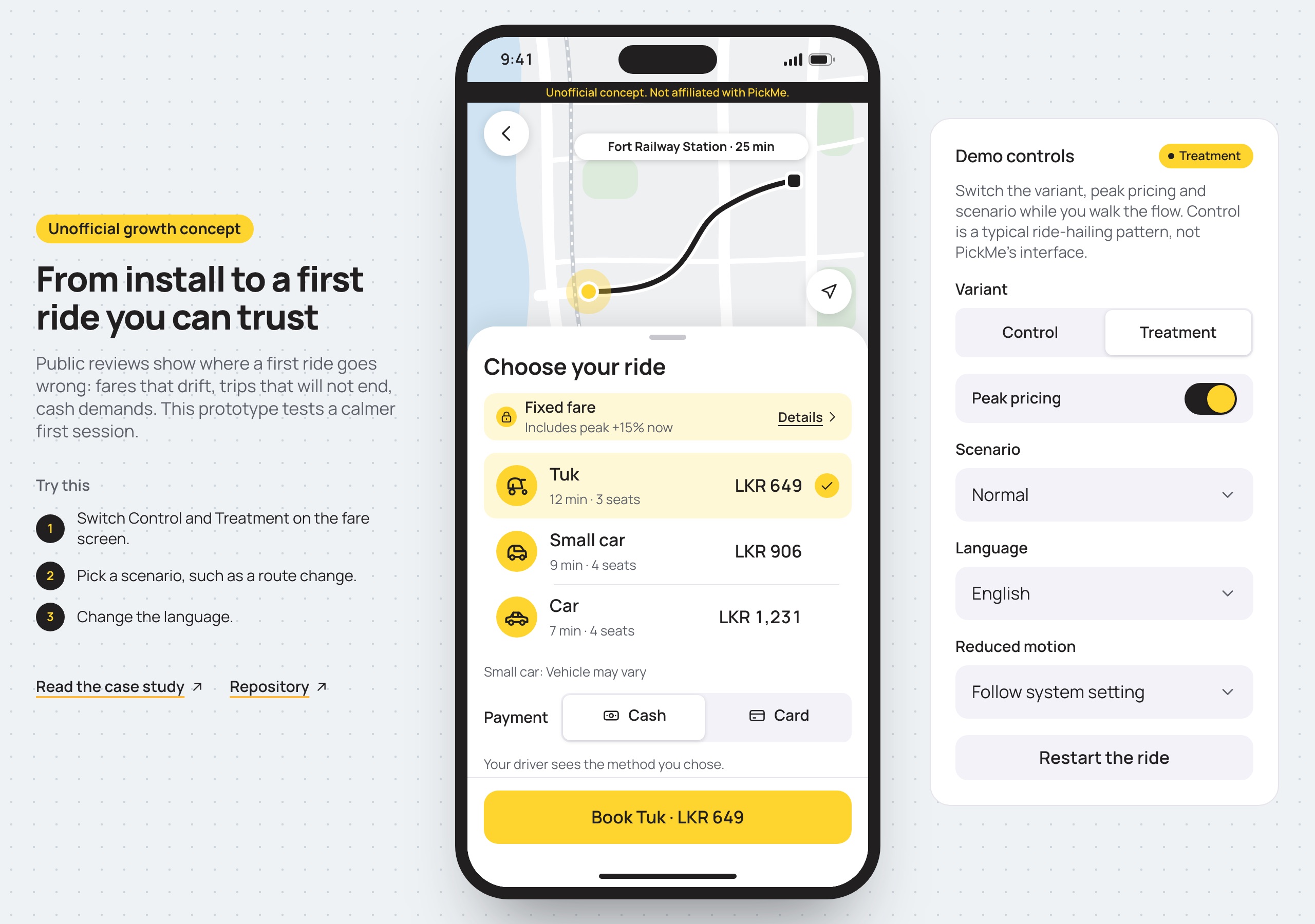
The same screen, one toggle apart. Control is a generic pattern, not PickMe’s interface.
What this is and is not
No one asked for this. It is a self-initiated concept about a new rider’s first session on PickMe in Sri Lanka. I have no access to the product, no PickMe data and no affiliation. The prototype uses PickMe’s brand colours (yellow and near-black) with Manrope so it reads as a refined version of the real app, but it has no logo, carries a non-affiliation notice on every screen and marks every field as demo only.
I chose PickMe because its public review record is visible. Everything I say about its behaviour is what reviewers report.
Two problems, two levels of evidence
The first session has two parts. Part A runs from install to a first booking. Part B runs from booking to the receipt and any help. I expected to find signup friction. I found no public evidence of it, and I treat that as a gap in my sample, not as a finding.
The evidence sits in Part B. Reviewers raise four themes, with roughly three to five items each: a fare above the estimate, a trip only the driver can end, a driver asking for cash on a card trip, and support that does not answer. That count does not show which is most common.
- About 30 dated reviews and posts, several seen only as search snippets.
- Google Play reviews were not read, and Trustpilot skews negative.
- Part A rests on a benchmark of six apps, so my confidence in it is low.
Where the funnel leaks
I mapped eight stages, from install to a second ride, and put the evidence beside each one. I did not invent conversion rates, because none are public. Where a rate is missing, the audit says what data would replace it.
- Install, signup and destination: no review evidence, benchmark only.
- Fare seen: indirect review evidence plus the benchmark. Booking confirmed and driver matched: review evidence, from a skewed sample.
- Trip paid without a dispute: the clearest mechanism, with no rate.
- Second ride: direction only. Support that does not answer reads as a reason not to come back, and that is my interpretation.
Two bets: fare before account, and a fare you can hold
The primary bet is a fare you can hold. The booking screen shows a fixed fare with its breakdown and the only three things that could change it: waiting more than five minutes, a route change the rider approves, and a stop the rider adds. The receipt explains any difference before payment. I narrowed this bet to the fare promise. The rider-side trip end and the dispute route are separate tests, so a result can be attributed.
The supporting bet is fare before account. A new rider sees a fare for their own trip before signing up, and the phone number and code are asked at “Book”. It rests on benchmark evidence and not on complaints, so I ranked it lower. The three change rules and the figures in the prototype are proposals and invented demo values.
Designing the flow in code
I wrote the screens as copy and states first, then designed them to follow iOS conventions (sheets, the type scale, 44 px targets) in PickMe’s yellow and near-black with Manrope: a stylised map with no map SDK under an iOS-style sheet, a compact fixed-fare row, an inset ride list with tuk, hatchback and sedan pictograms, and a receipt that itemises any change. I built them in React, Vite and TypeScript. A single reducer holds the ride state: step, variant, language, scenario, fare and its changes. Every scenario is one dispatch away, so a route change or a driver cancelling is a switch in a demo panel.
A toggle moves the whole prototype between control and treatment. A second control switches the ride between normal, no driver, driver cancels, route change and driver asks for cash. Totals and receipt lines are computed from distance and state, never hard-coded, so the breakdown sums for every destination and ride type.
- 13 screens: ten for the ride and three for getting to a first booking.
- Three ride tiers, named generically: Tuk, Small car and Car.
- Fares, plates, rates and the 60 second and 24 hour values are invented.
Sinhala, Tamil and a screen reader from day one
English is the source of the strings, and Sinhala and Tamil sit beside it in the same type system. All 11 rider screens are translated; the intro and the review storyboard stay in English because they are for portfolio visitors. The page language follows the choice, and the Sinhala and Tamil text uses Noto fonts with more line height. The Sinhala and Tamil copy is a machine draft, and I say so on screen.
Everything works from the keyboard, targets are at least 44 pixels, and state changes are announced politely, with a driver cancelling announced assertively. Reduced motion replaces the timers with a “Skip wait” button. axe-core runs on every route in both variants and all three languages, 78 checks with no violations. Automated checks do not replace a test with a screen reader and a person who uses one.
How I would test it
Riders would be assigned at their first fare view, and I would analyse everyone assigned, not only those who book. The primary metric is a second completed ride within 14 days of assignment. The baseline is unknown, so the plan gives a table across baselines and lifts. The planning case is a 15% baseline and a 3 percentage point lift: about 2,403 riders per arm, or about 4,800 in all.
A fixed fare changes pricing and liability, so the plan proposes who pays. Waiting, an approved route change and an added stop are paid by the rider and passed to the driver. An overrun the rider did not approve leaves the fixed fare unchanged, and the platform absorbs it up to a per-trip cap, kept under 1% of treatment gross fares. On a cash trip, explaining a change before payment is a norm the app cannot enforce. Both arms quote the same number at booking, so a difference reflects the promise, not the price. Guardrails cover driver acceptance, driver earnings per hour, cancellations, support and crashes. Drivers serve both arms, so rider-level assignment can leak, and I would monitor that. I would ship only if the lift reached the minimum effect and its confidence interval sat above zero.
- 15% baseline: 5,274, 2,403 or 1,384 per arm for a 2, 3 or 4 point lift.
- 25% baseline: 7,551, 3,397 or 1,934 per arm.
- 35% baseline: 9,042, 4,043 or 2,287 per arm.
What is missing
None of this has been tested with a rider. I have not done the following.
- A teardown of the app on a clean device.
- Five rider interviews, and a usability test of the prototype.
- Native-speaker review of the Sinhala and Tamil copy.
- Real PickMe baselines, and an agreement on driver economics.
- Local questions such as tolls and parking paid in cash, the night surcharge and rounding.
How I work
The same process runs on every project. I own the design throughout; the build is a team effort in which I build much of the front end. This is what each stage looked like here.
In general
I review what exists and talk to the people closest to the customer. Then I write the brief, before opening Figma.
- Brief
- Audit
- Journey map
On this project
I reviewed about 30 public reviews and posts, several only as search snippets, and benchmarked six apps before choosing what to design. The problem was not where I had expected it.
Highlights
- Part B, fare trust, has the review evidence. Part A, fare before account, is benchmark-only, so it ranks lower.
- The fare sheet states the only three things that can change the price.
- The receipt explains each difference as its own line before the rider pays.
- A rider can end the trip if the driver has not, and a proposed 60-second timer closes it if neither does. That is a separate test (H2).
- Control and treatment are one toggle apart, so the comparison is in the prototype itself.
Outcome
A deployed, accessible prototype in English, Sinhala and Tamil of one flow, with the research, the funnel reasoning and the test plan behind it. It has not been tested with riders or shipped, and I make no claim about its effect on any metric.
What I’d do differently
I would run the teardown and five rider interviews before building, because the storyboard stands in for evidence I should have gathered first. The next step is the teardown and the interviews, and a native speaker reviews the Sinhala and Tamil copy before any rider sees it. If driver-side pricing proved contentious, I would test the rider-side trip end before the fixed fare.
14 Screens · 18 captures
Select a screen to enlarge
01 Opening screen, with the unofficial notice, the language control and the choice to start the ride or see the problem first.
02 Problem storyboard: four reviewer-reported themes, each with a short quote, its platform and its date.
03 Welcome in the treatment: a language choice, then “Where are you going?”, with no account wall.
04 Welcome in the control: “Create an account to continue”, with the phone field first.
05 Destination entry with five mock places in Colombo and the line “Fare is shown before you book.”
06 Choose your ride in the treatment: invented demo fares for Tuk, Small car and Car, fixed at booking, with a link to what can change them.
07 Choose your ride in the control: the same fares, labelled as estimates, with no breakdown.
08 How this fare is made: base, distance and peak lines that sum to the total, and the three things that can change it.
09 Confirm your number, shown at “Book”: one code field that accepts paste and autofill.
10 A matched driver, with a sample plate, a hidden phone number and the payment method the driver agreed to.
11 Driver-cancelled state: the fare stays as booked and there is no cancellation fee.
12 On the way, with a route-change notice that names the extra amount and lets the rider accept it or ask at the end.
13 Arrival screen where the rider can end the trip, with the driver able to end it too.
14 Receipt showing the booked fare, the accepted route change as its own line and the new total, before payment.
15 Help ticket opened in one tap, with a ticket number, a proposed reply time and the extra amount on hold.
16 The receipt in Sinhala, using a machine-drafted translation that still needs native review.
17 Choose your ride in Tamil, using a machine-drafted translation that still needs native review.
18 Desktop view: the phone frame with the concept note and the demo controls beside it.